<<< Previous Section: Product Pages
SaaS Pricing Pages
With pricing sometimes omitted partially or completely from the page, SaaS pricing pages can be unique when compared to ecommerce, marketplaces, or other online business models.
People tend to hit your pricing page in two modes:
- A quick check early in their buying cycle to make sure your product fits in their budget and is worth spending more time researching
- When they’re deep into their product research and close to signing up
You want to make sure your pricing is above the fold and very easy to notice for the first group.
For the second, you want to get in closing mode and hit them with quotes and case studies that highlight the value customers experience with your product, a clear feature matrix, and a FAQ that covers all major questions.
The further down your funnel someone is, the more resources on average you’ve spent to get them there. On the pricing page, potential customers are close to the end of their evaluation process and signing up for an account or demo.
So it’s worth spending more time on your pricing page than even your product page to make sure your pricing plans are clear and the rest of the page is compelling and optimized for quick understanding.
If you don’t feel confident about the clarity of your pricing or plans, here are some resources for further reading:
Common Pricing Page Components
- Header
- Hero (Headline, Subheadline, and CTA)
- Plans
- Social proof
- Plan comparison
- CTA repeated
- Other website sections
- Footer
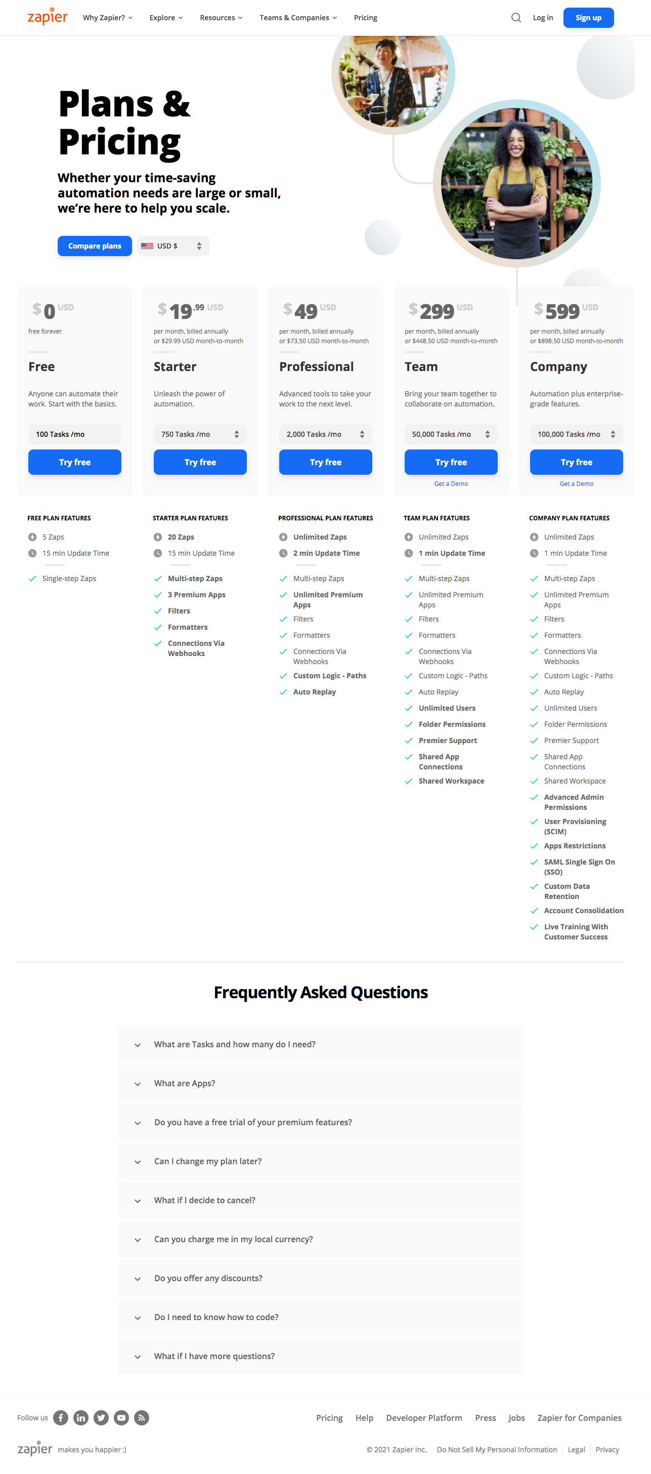

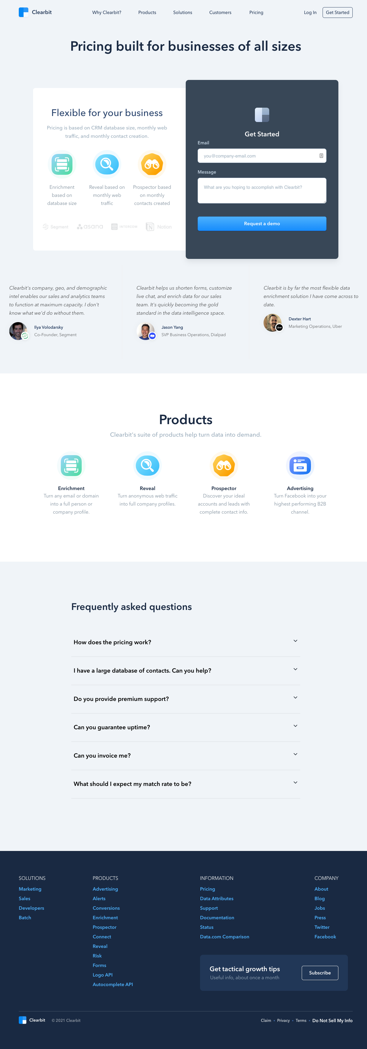
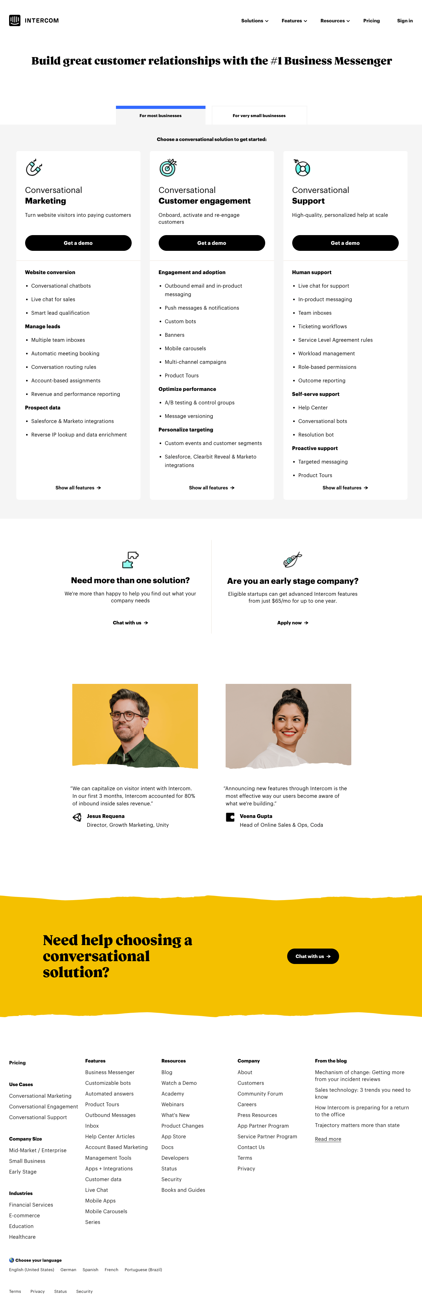

Hero
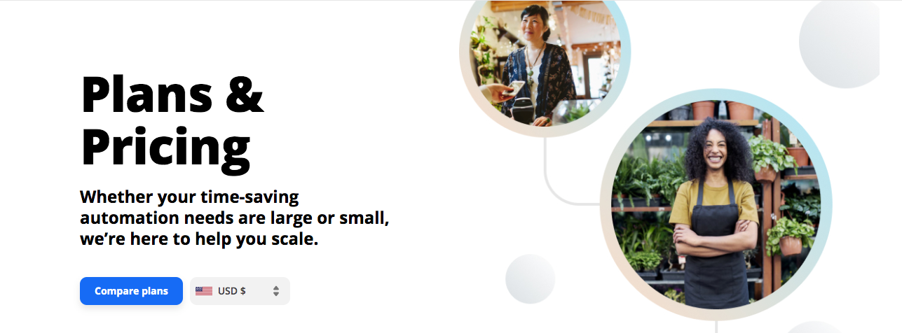
Use the hero to reinforce the value proposition and remind visitors of the outcome of using your product.
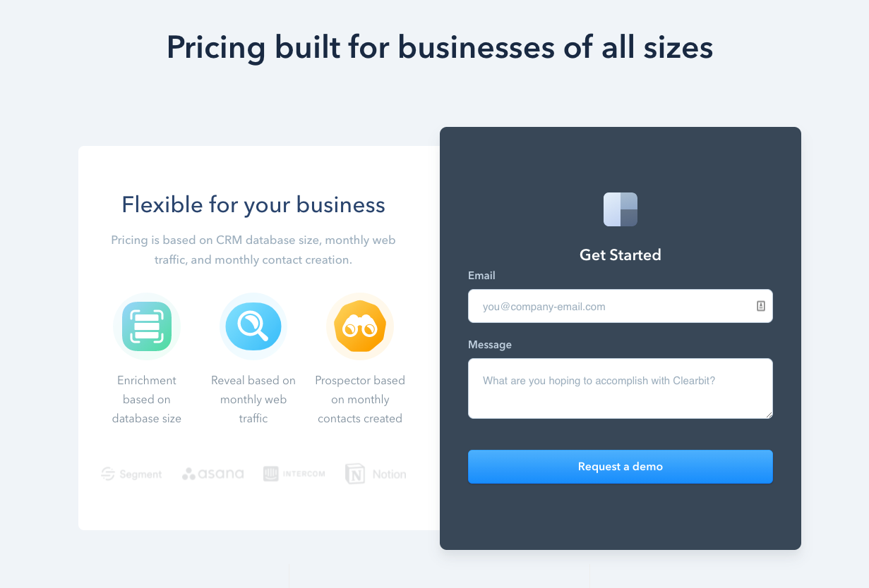
Pricing page heroes tend to be pretty simple with only a headline and subheadline in order to make a quick sales point and get out of the way of your plans and pricing.
“Pricing” is actually a common pricing page headline, but this misses an opportunity to further sell.
Shorter than homepage hero subheadlines, the subheadline on pricing pages is often a simple one-sentence statement that reinforces the headline.
Pricing page heroes don't typically have a CTA because they're usually included in the plans section.
Hero Examples



Plans
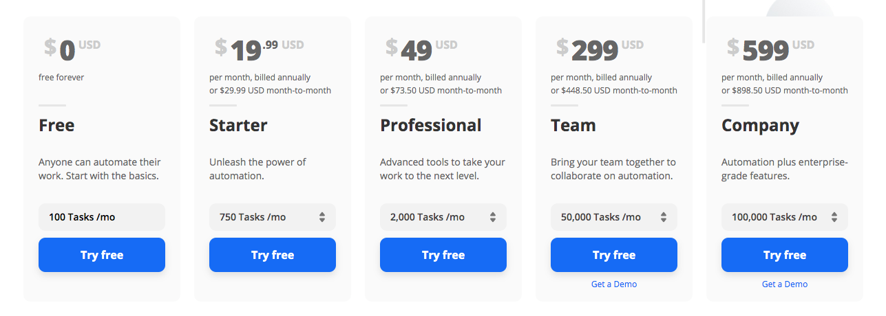
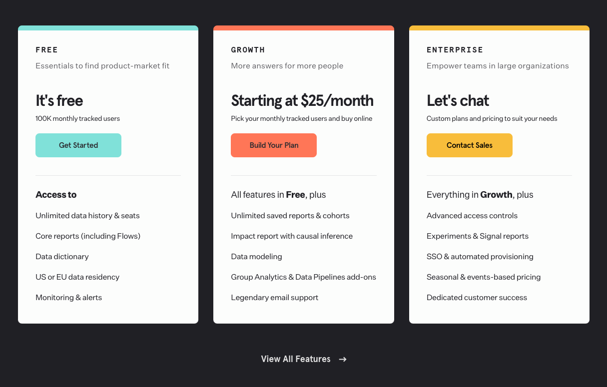
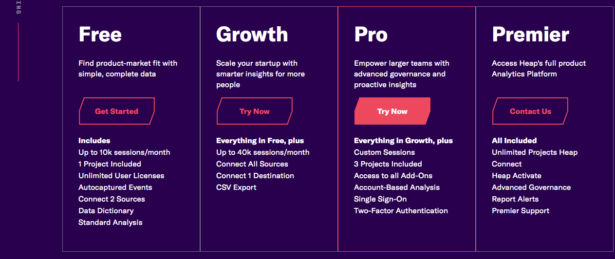
Plan sections have to summarize a lot of information as clearly as possible as even a small misunderstanding can make your product seem too expensive and kill a sale.
Plan sections on pricing pages usually consist of the following components:
- Plan name
- Plan price
- Highlighted features per plan and/or usage allowances
- CTA to sign up or schedule a demo
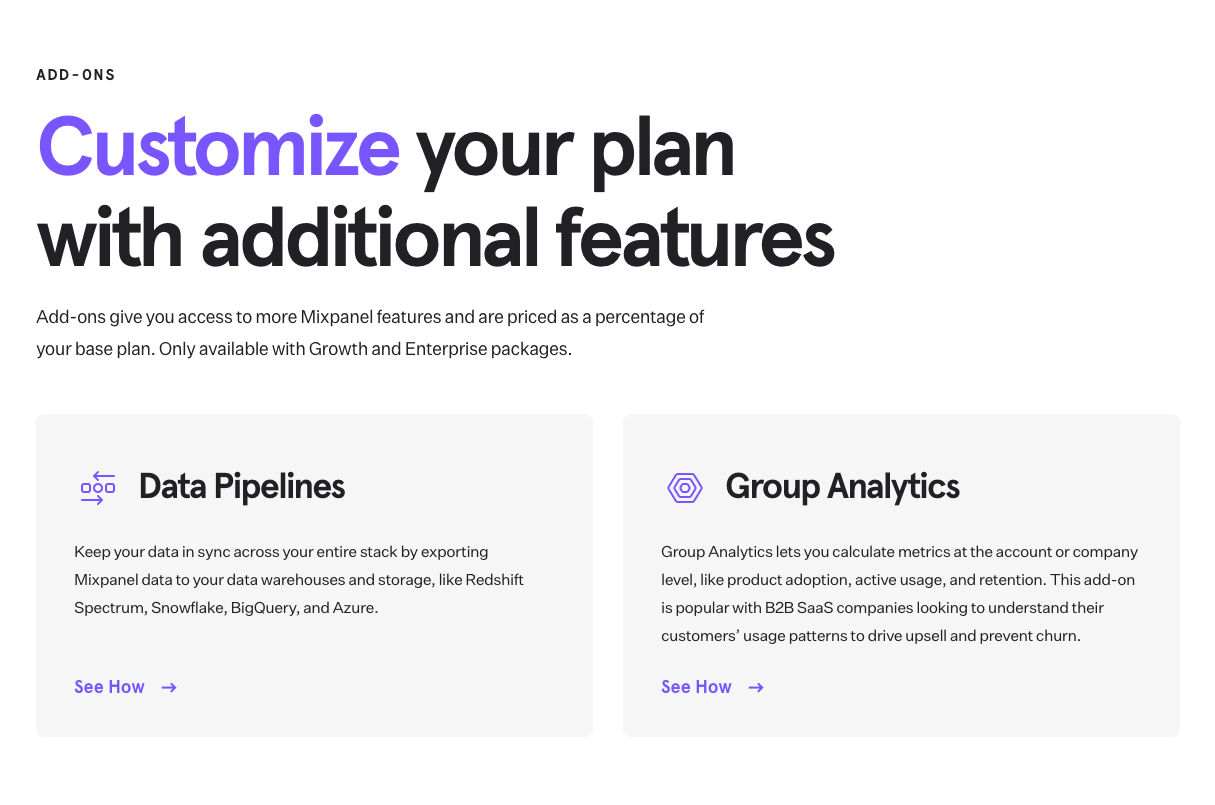
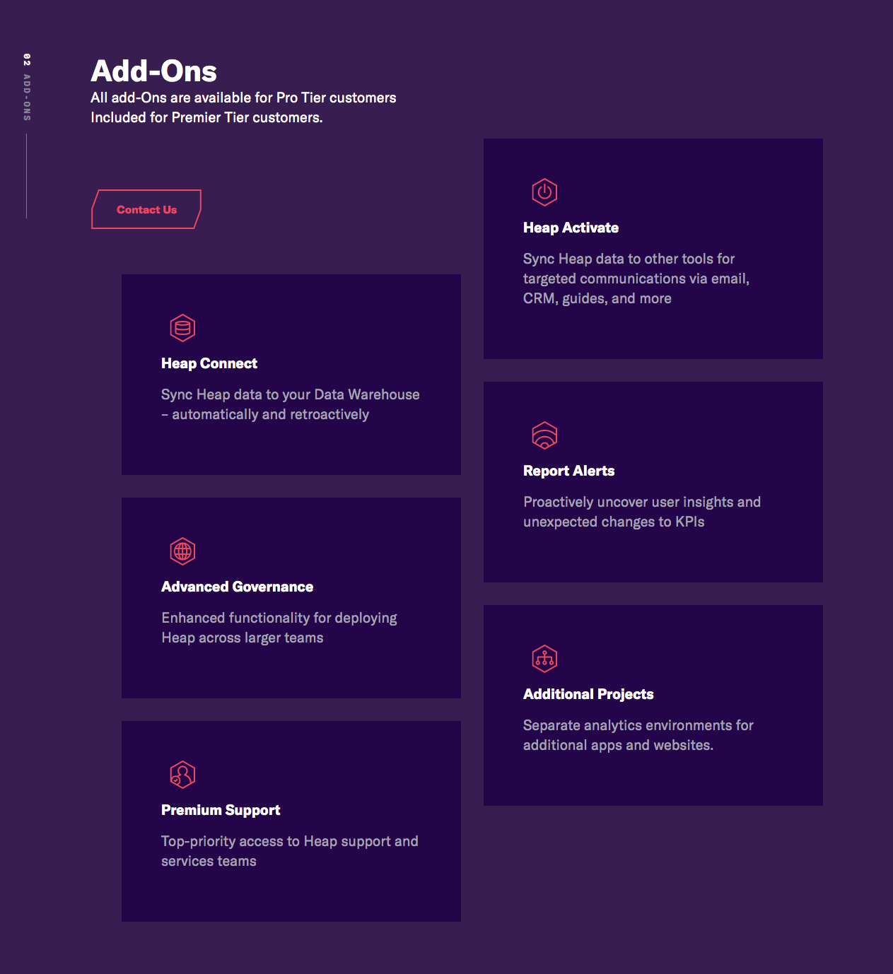
Some companies have add-on products like analytics or training and feature these in a section directly below the plans.
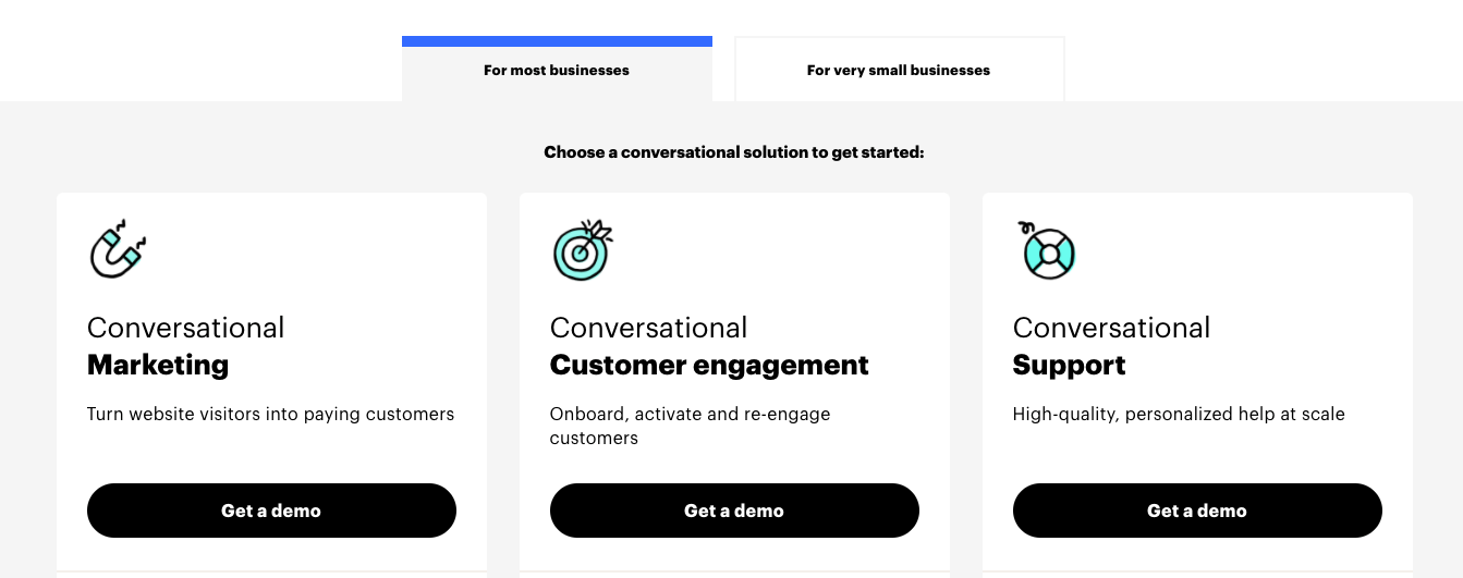
More and more companies have both self-serve and sales-driven plans and will list pricing for self-serve plans while including a demo CTA for sales-driven plans in place of a price. It’s common to not list even a base price for sales-driven SaaS tiers.
If you offer annual plans, you can add a toggle button to allow potential customers to compare pricing easily.
Plan best practices:
- Standardize language across plans to make comparison easier
- Highlight the most popular plan to draw attention to it
- Order plans from most to least expensive, so that the lower plans seem like a better deal due to price anchoring
- Include a short sentence about who each package is for
- Include no more than five plans in one section and ideally only three or four.
- Save room by building off previous plan features for the next plan, e.g. “Everything in our premium plan plus…”.
- Include a price calculator if your pricing has any metered products
Plan Examples
Plan Add-On Products Examples
Social Proof
Keep in mind that the visitor is likely towards the end of their evaluation process if they’re looking at this page in depth, so choose social proof that “proves” your product’s value, with quotes and case studies highlighting important percentage gains or drops your product gave customers.
Social proof on the pricing page most commonly has a dedicated section directly below pricing plans and is sprinkled throughout the rest of the page in relevant areas.
Social proof on pricing pages typically comes in the form of:
- Logos
- Quotes
- Quotes with customer photo and title
- Case study links
Plan Comparison
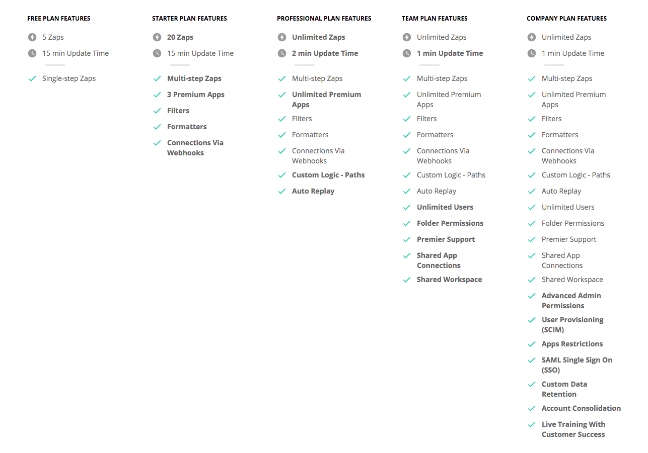
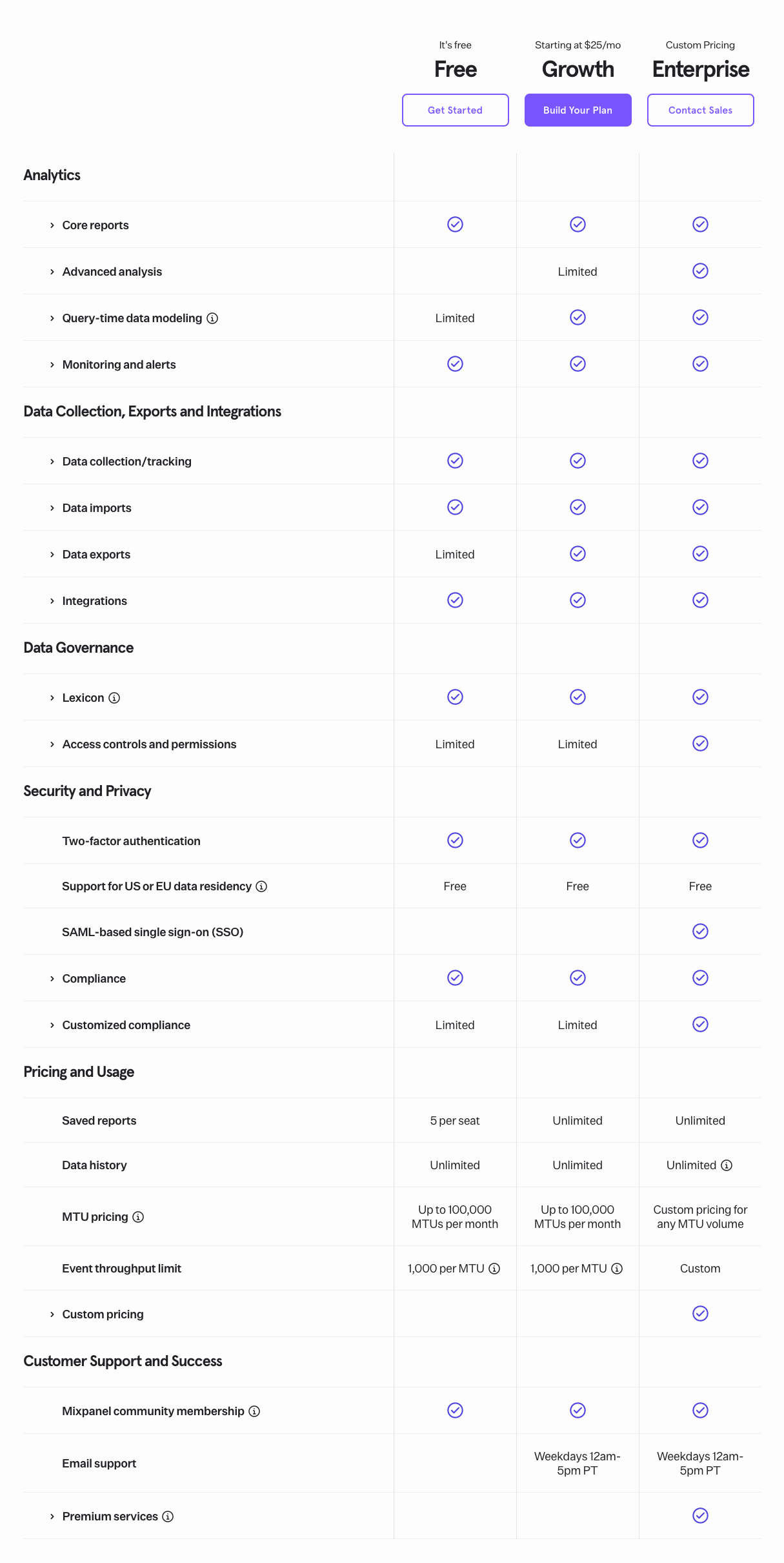
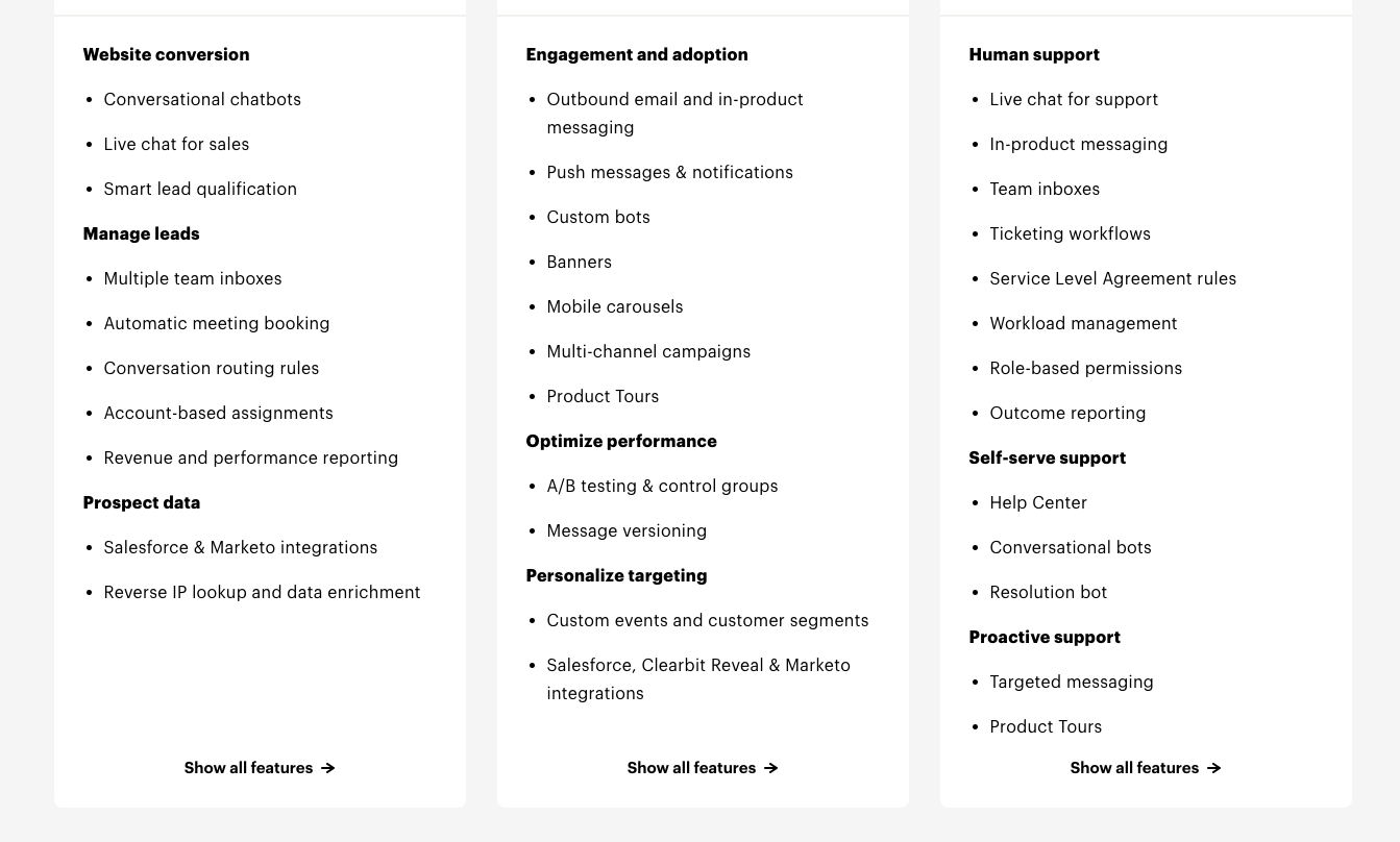
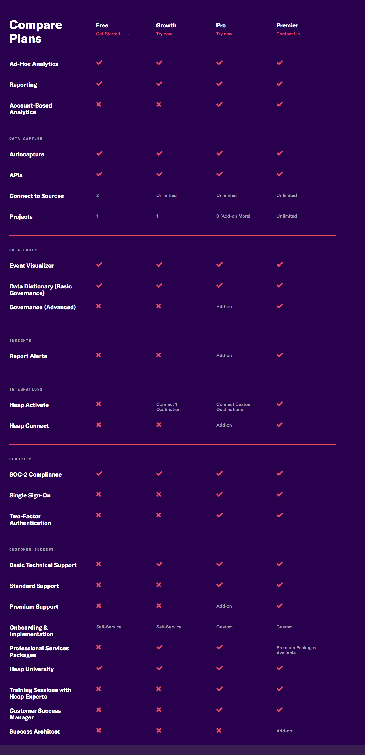
Plan comparisons come in a matrix with features on the left and plans at the top. It displays what feature is included in what plan, but sometimes it’s in the form of a full feature list.
Plan Comparison Examples
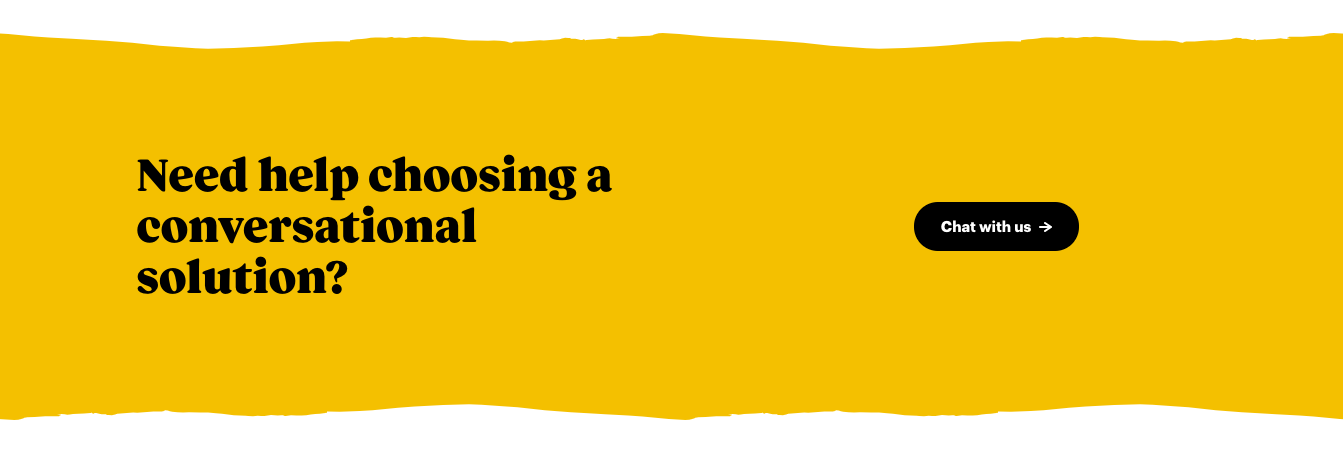
CTA Repeated
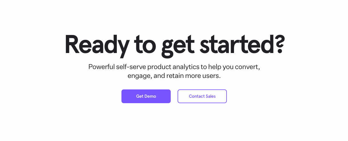
This is generally a repeat of the hero message, but shorter and with language that considers the visitor has scanned down the page and learned about your pricing by this point.
CTA Repeated Examples

FAQ
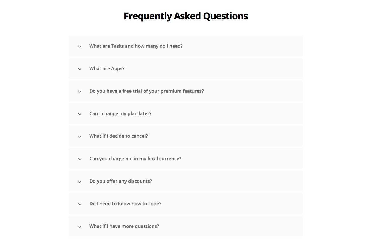
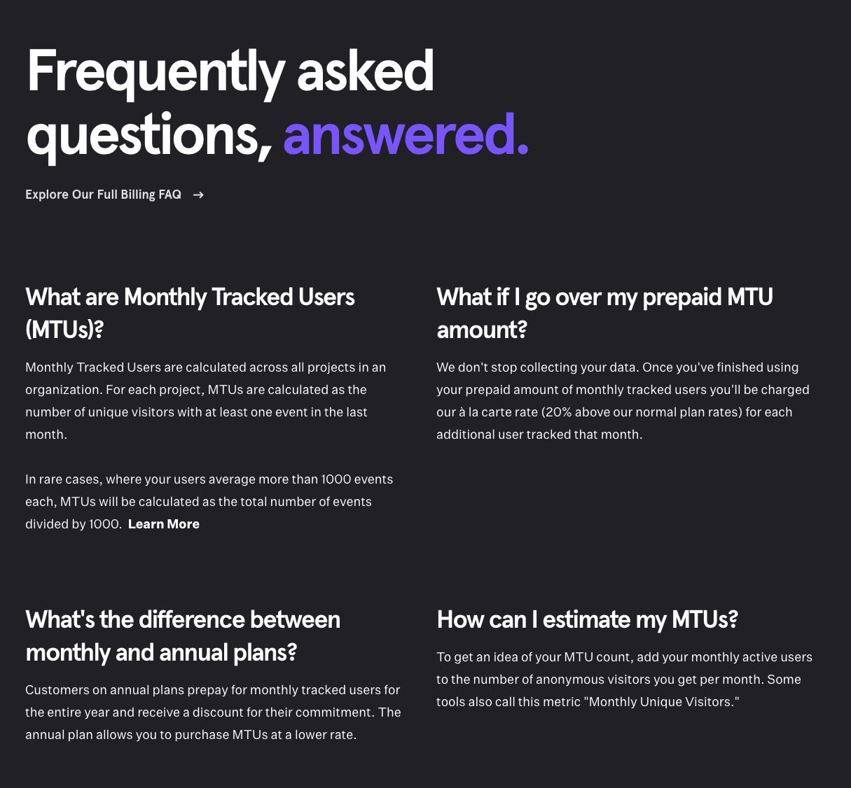
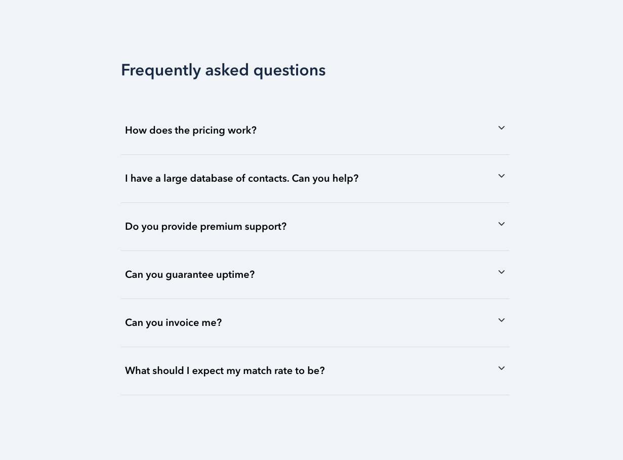
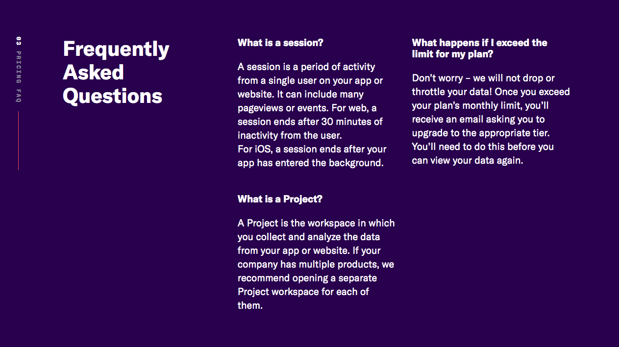
FAQs serve as a dedicated area to answer the most common questions about pricing and other questions asked at the end of the funnel. A visitor reading a FAQ on a pricing page can be considered to have very high intent.
FAQs cover questions that don’t fit anywhere else like cancellation policies.
Common questions include:
- What happens if I exceed my plan quota?
- Are there setup fees?
- What is your cancellation policy?
FAQ best practices:
- Keep your answers simple and no more than three sentences
- Keep track of questions your customers ask before buying so you’ll know what they ask most frequently in their own words and add the most common to your FAQ
- If you have lots of questions, try categorizing them under headings.
- Keep the number of questions under 12 to avoid overcrowding the pricing page. You can put anything that doesn’t make the cut in your help section.
- Consider allowing visitors to expand and hide question answers. This makes it easier to scan the questions.
- Include a “Have More Questions?” section at the end and link it to your help or contact page.
FAQ Examples
Next Section: Solutions Pages >>>